
Introduction by Mark Kelly
Twenty years ago, already working for Locus as the magazine’s monthly short-fiction reviewer since 1988, I volunteered to Charles N. Brown to set up a Locus website. It was the early days of the web and it was becoming fashionable, even necessary, for any kind of institution or publication to have an online presence. Not coincidentally, I volunteered for a similar task at my workplace, an engineering firm that built the Space Shuttle Main Engines among other things, to create an internal website for my department, and so was able to learn HTML on company time and then apply it in my spare time to building a Locus site. (In the following years I used a similar tactic to learn how to build databases in Microsoft Access, and then to generate webpages from them, which led to my SF awards sites.)
From the beginning this site’s mission has been to post samples of content from Locus Magazine, as enticements to attract new subscribers, and to post supplemental material special to the site, as bonuses for regular readers. I also recognized early on that there were three principal ways websites have advantages over print publications: they can post content in a timely manner and update continuously (rather than publishing periodic ‘issues’); they can accumulate content (like indexes) on static pages without having to issue periodic print volume updates; and they can link to other sites and posts on other sites to allow access to information without posting such information themselves. I think the site has successfully exploited all three advantages, over the past two decades.
Here’s a timeline of significant developments, and featured posts, over those 20 years. Note that any posts older than 2009 display earlier designs of the site (and early pages were very narrow by current standards!). Below the featured posts is a gallery of homepage captures, showing the development of the site’s design since the beginning.
–Mark R. Kelly
17 April 2017
Timeline
1997
- April 17: Locus website launches, with listings and samples from the magazine, a Breaking News page, letters, and a quiz. (Update history)
- October: site redesigned and renamed Locus Online, with an editorial (with two asides about technical issues of the time), descriptions of new books, magazines, and websites, and a page called Aether Vibrations.
1998
- New sections are added: Field Inspections, Media Refractions, a weekly Bestsellers page, and descriptions of nonfiction books
1999
- We get lots of letters
- Year-end best books are tallied
- Review extracts from the magazine highlight two books a month
- The site conducts an independent poll with categories for all-time short fiction, and survey
2000
- March: ICFA inspires Locus Online‘s first April 1st issue. (See below on this page for a selection of April 1st posts.)
- The site starts running occasional special-to-the-website full length reviews, by Rich Horton, Michael Swanwick, and others.
- We try to keep up with E-zines.
- A short-lived Skiffy Flix feature tracks critical reactions to sf/f/h movies.
- July: Conolulu and Vacation Report, about Westercon in Honolulu with Charles N. Brown, experimenting with a new digital camera.
- Several pages of Prose Quotations are compiled; these would eventually find a home at the bottom, or sidebar, of each week’s New Books page.
- Website readers are asked what they like about the website and we respond.
- June: the Locus Index to Science Fiction Awards launches
2001
- Spring: first online Locus Poll and Survey ballot includes a bonus question for online voters: Name the 5 deceased 20th century SF & fantasy writers you think will still be read 50 years from now
- The site runs numerous special-to-the-website reviews by John Shirley, Claude Lalumiere, Nick Gevers, and others
- Pop-up This Week windows [pop-up function now discontinued] track new books and author events for most of the year, before merging back onto the homepage
- On 9/11, reports from New York City (scroll up for more), followed by an essay by Marleen Barr
2002
- March: The Locus Index To Science Fiction Awards expands to full capacity with 80+ awards, FAQs, tables, statistics, essays.
- Directories of each year’s books by category begin.
- August: regular pages launched for New in Paperback and Classic Reprints, as New Books pages go weekly (in theory)
- September: Locus Online wins a Hugo Award for Best Website.
- Throughout year: dozens of reviews and commentaries by John Shirley, Gary Westfahl, Rich Horton, Lawrence Person, Philip Shropshire, Jeff VanderMeer…
2003
- June: Locus Online wins first of three Wooden Rocket awards
- Still running lots of reviews, by Lawrence Person, Cynthia Ward, Jeff Berkwits, Greg Benford, et al.
- Separate pages for Aether Vibrations, Field Inspections, E-Publications, etc., are discontinued due to time constraints, and are replaced by a Blinks column, first on the What’s New page, then on the homepage.
- Editorial blog Views from Medina Road begins, covering developments on the site, convention reports, reading, etc.
2004
- January: updates to the What’s New page are discontinued, as the homepage loses the colored tab sections and posts become strictly chronological, blog-like; at the same time archives are split by section — News, Monitor, etc.
- Regular coverage of selected SF/F films, covered by Gary Westfahl and/or the team of Lawrence Person and Howard Waldrop (the latter through 2012), begins.
- October: editorial blog Views from Medina Road launches.
- Fall: The first version of a Cover Art Gallery is posted.
2005
- May: webpage templates are rebuilt using style sheet tags instead of hard-coded html for spacing and formatting
- Locus Online receives a Hugo Award nomination for Best Website but loses to Sci Fiction by one vote.
2006
- Spring: a poll for best poetry of the year and of all-time draws a light response
- Fall: Locus Online begins posting selected columns and reviews from Locus Magazine, by Cory Doctorow, Graham Sleight, and regular reviewers
2007
- February: a Book Editors page is compiled as reference for the new Hugo Award category for Best Editor, Long form
- April 17: 10th anniversary.
2008
- December: Locus Magazine staff takes over posting news on the site, via Blogger
2009
- February: Locus Roundtable starts, initially with help from Adrienne Martini and Graham Sleight on Blogger, moved to WordPress in May 2010 and edited by Karen Burnham through December 2013, and by Alvaro Zinos-Amaro since then. (Earliest post is here)
- July: Charles N. Brown dies, with Liza Groen Trombi taking over as editor-in-chief of the magazine; the website continues as before.
- News blog moves to WordPress, followed by parallel blogs for Monitor, Reviews, etc., with matching designs.
2010
- Feb: Lois Tilton’s short fiction reviews move to Locus Online, following discontinuation of The Internet Review of Science Fiction, with three columns per month through December 2015.
- April: Locus Online editorial blog (“Views from Medina Road”) moved from Blogspot to WordPress; the Blogspot version is still there, at http://locusmag.blogspot.com/
- News blog moves to WordPress, followed by parallel blogs for Monitor, Reviews, etc., with matching designs.
- June: Posts within the Monitor, Reviews, and Perspectives column (still by Mark R. Kelly, not the Locus staff) become daily, with monthly archive pages (e.g. June 2010) maintained since then. By this time site design had reached its present form.
2012
- Jan: Paul Di Filippo starts book reviews, two per month and then three beginning June 2014
- July: The Locus Index to Science Fiction Awards splits away from locusmag.com and becomes its own site, sfadb.com, Science Fiction Awards Database
2013
- April: Mark R. Kelly’s Locus Online editorial blog moves to own domain www.markrkelly.com, becoming a different kind of blog.
- April: Last April 1st humor pieces posted.
2014
- January: Alvaro Zinos-Amaro takes over running the Roundtable
2015
- Locus Magazine relocates from Oakland to San Leandro, following the sale of Charles N. Brown’s house; Locus Online relocates from Los Angeles to Oakland
Selected posts by Locus Online‘s contributors
Gary Westfahl, commentaries and film reviews since 2001:
1 July 2001 (his first review for Locus Online): Me, Robot: A Review of A.I.
The best sorts of science fiction raise difficult questions about science and humanity’s future and attempt to wrestle with those questions as best they can. Steven Spielberg’s previous science fiction films, I have argued elsewhere, vigorously avoid difficult questions in an effort to please the crowd and make people feel good about themselves. A.I. may qualify as Spielberg’s best science fiction film simply because it does raise difficult questions …
6 March 2011: Philip K., Diminished: A Review of The Adjustment Bureau
The operatives of Hollywood’s Adjustment Bureau had gathered to map out strategies for their latest assignment: given this quirky little story by Philip K. Dick, “Adjustment Team” (1954), how could they “adjust” its plot to transform it into a crowd-pleasing blockbuster?
23 Feb 2009: Pitfalls of Prophecy: Why Science Fiction So Often Fails to Predict the Future
As a person regarded in some circles as an expert on science fiction, I was once asked to give a presentation offering some predictions about the future; science fiction writers routinely face the same request.
6 March 2006: Homo aspergerus: Evolution Stumbles Forward
As publicity about the condition has increased in recent years, I have gradually come to the conclusion that I have suffered all my life from an undiagnosed case of Asperger’s Syndrome — although, as will be explained, I don’t think that “suffered” is the proper term.
Paul Di Filippo, book reviews since 2012:
22 Apr 2012: review of Samuel R. Delany’s Through the Valley of the Nest of Spiders
Samuel R. “Chip” Delany wants to push your buttons—I mean that in a good way—and really knows how to do so in the most esthetically magnificent, narratologically adroit, intellectually rich, and filthily transgressive fashion.
7 Oct 2016: review of Ursula K. Le Guin’s The Found and the Lost: The Collected Novellas of Ursula K. Le Guin
How can a reviewer possibly say something fresh and illuminating about a writer of Ursula K. Le Guin’s immense stature, at this epochal moment in her career?
Lawrence Person & Howard Waldrop, film reviews:
Lawrence Person only:
10 Apr 2003: Donnie Darko: The DVD
But it is one of the most original, complex, and interesting SF films to come out of Hollywood in a long time, and it may very well be the most overlooked SF film of the last decade.
Lawrence Person & Howard Waldrop:
23 Oct 2006: Movie Review of The Prestige
Both: All year we’ve been complaining about the movies we’ve been reviewing here. We told you we’d let you know when Locus finally sent us to a good film. And now, in recompense for our suffering, we get to review The Prestige. But in a way we’re still waiting, because The Prestige is not a good film.
The Prestige is a great film.
Lawrence Person & Howard Waldrop:
8 Nov 2004: The Incredibles
The question isn’t whether it’s going to win the Oscar for Best Animated Film, the question is whether it will win the Oscar for Best Film. We fully expect it to be nominated; it’s that good. First, you forget you’re watching a Pixar movie. Then, you forget you’re watching a movie…
Lois Tilton, short fiction reviews:
Lois Tilton reviews Short Fiction: early November 2015
This time I feature a science fiction anthology and recommend the John Barnes story as one of the year’s best. Also a couple of first-of-the-month publications.
Lois Tilton reviews Short Fiction, mid-August
Featuring a really fine issue of F&SF, with the Good Story Award to Andy Duncan. The current issue of Shimmer is also particularly worth reading.
Among Many Others…
- Nick Gevers, 2001: The Best SF and Fantasy Short Story Writers: A Contemporary Top Ten
- John Shirley, 2004: Global to Local: The Social Future as seen by six SF Writers: Cory Doctorow, Pat Murphy, Kim Stanley Robinson, Norman Spinrad, Bruce Sterling and Ken Wharton
- Bob Eggleton, 2004: Godzilla at 50
- Mark R. Kelly, 2008: Review of The Fly (the opera)
- Jeff VanderMeer, 2011: An Overview of International Science Fiction and Fantasy, 2010
- David Brin, 2013: Our Favorite Cliché — A World Filled With Idiots…, or, Why Films and Novels Routinely Depict Society and its Citizens as Fools
(See Indexes to Contributors, Film/Media Reviews, and Online Book Reviews for complete compilations of website content special to Locus Online — though the last index also includes sample reviews posted online from Locus Magazine.)
Selected April 1st posts
Inspired by a patio conversation with Charles N. Brown and others at ICFA, the International Conference on the Fantastic in the Arts held every year in Florida, in 2000, Locus Online posted April 1st humor pieces for many years, usually using anagrammed versions of their contributors’ names.
- 2001: Amazing to Relaunch as a Breakfast Cereal, by James Patrick Kelly
- 2002: Locus Online Awards Announced, by Karl Kerrybot Lem
- 2004: Review of THE EINSTEIN CODE, by Ben Gory Gerdorf
- 2005: Paradise Lost:
A “Next Wave” of Year’s Best Anthologies Planned, by Ferje Vedfammer - 2006: Richard Branson: Malzberg to Fly Virgin Galactic Free, by Paoli du Flippi
- 2007: New award established “to honor excellence in science fiction awards”, by Marshal Gegith
- 2008: Final Martin Manuscript Triggers Mass Suicides at Bantam, by Narceen Plowers
- 2012: Margaret Atwood Launches New SF Magazine, by L. Ron Creepweans
- 2013: Review of William Gibson’s Realm of the Enchanted Unicorn, by Hal Graftswey
(The site’s Index to Contributors includes all the April 1st humor pieces, indexed under actual names of authors.)
Selected Roundtable posts:
- January 2011: SF vs. The Future, 23 pages of back and forth by many contributors
- November 2013: Roundtable on Organizing Books, discussion among many contributors on one very long page
- October 2014: Roundtable on Lucius Shepard (remembrances)
- January 2015: A Cheery Holiday Roundtable, about publishing despair
- May 2016: Ada Palmer Guest Post–“World Building and Change in Terra Ignota”
- April 2017: Jess Nevins Guest Post–“How It All Started”
Gallery
Here is a selection of homepage captures from the past two decades, as the design of Locus Online has changed, reflecting the changes in design standards across the web: e.g. as screen resolutions increased, sites got wider; layouts settled on reverse-chronological order of new posts; page designs became unified through stylesheets; graphics became more important. Over the years I looked to professional sites like CNN and Slate for design cues. For the first decade every page on the site was composed manually. In 2008 we began using first Blogger, and then WordPress, to host portions of the site, beginning with the News, though the homepage is still edited manually, in part, to this day.
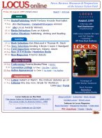
The earliest homepage used basic HTML tables with resizeable color graphics to mimic the front cover of the magazine, which in 1997 always had a big red border (like Time Magazine); the width was 600 pixels.

By 1999 the site established its own logo (font: Souvienne), subtitle (“News, Reviews…”), and a three-column layout with colored headers, rather cluttered text, and surrounded by a thin curved-corner border, at just 585 pixels wide. Within a few months this was cleaned up a bit with a single main section separate by tab-like colored headers. (Length of screen captures varies depending on content at the time.)
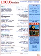
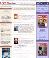
The first expansion of the site, to 750 pixels wide, came in 2001, allowing a left sidebar for cumulative links. This is what the site looked like in the year for which it won the Hugo Award.

By 2004 the homepage went to a strict, reverse-chronological order for main posts down the center. A new tiny spaceship icon was placed at the bottom right. Then by 2005 the width crept out to 800 pixels, drop-down menus were established along the top, and the colors changed from the tan and lavender scheme to the blue/green and lavendar scheme similar to what’s still in use.

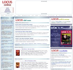
In 2008 the width jumped to the current 980 pixels, allowing for the logo, and two standard-sized banner ads, across the top.

In December 2008 the Locus Magazine staff took over the posting of news on the site, via Blogger, and the homepage was rearranged to highlight the latest news posts in a box at the top of the central column. (While a different set of drop-down menus was located below the logo in upper left.) In this May 2009 capture, the banner ads have been removed.
In 2009 and 2010 the News blog migrated from Blogger to WordPress, and the other main sections of the site — Reviews, Monitor, Perspectives — were set up in matching blogs. (The manually created design of the homepage was applied to the WordPress blogs, with appropriate variations; no pre-designed WordPress templates have ever been used.) By June 2010 the current homepage design was established, with gradiant colors behind both left and right sidebars, thinner end-caps and separators, the main central column reduced so that all three sections are of roughly equal width, and a new set of horizontal drop-down menu bars.
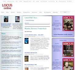
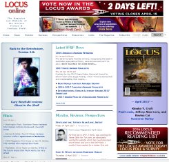
And here’s the homepage as it looked on April 14, 2017.