Spotlight on Richard A. Kirk
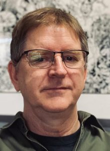
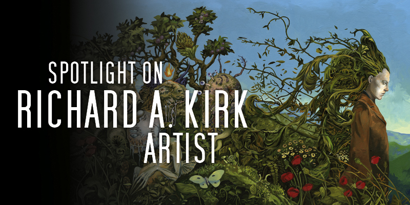
Richard A. Kirk is an author, illustrator, and visual artist. He is the author of novels The Lost Machine and Necessary Monsters, and illustrated collection Magpie’s Ladder. Illustrated novel Tailor of Echoes was published in early 2022. He has illustrated works by Clive Barker, Christopher Golden, Frank Herbert, Caitlín R. Kiernan, Thomas Ligotti, China Miéville, the rock band Korn, and others. Kirk’s artwork is exhibited and collected internationally. When not at the drawing table or laptop, he can be found attempting to tame his unruly garden or reorganizing his books, again. He lives in London, Ontario, Canada with his family, a dog, and a cat that doesn’t particularly like the dog.
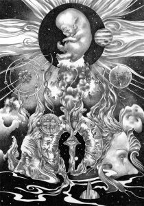
What was your introduction to working in the field of science fiction and fantasy cover art? What were the influences that drew you in?
As a kid I loved hanging out in the science fiction section of used bookshops. The covers from those days were a point of entry into endless worlds. Harry Willock’s covers introduced me to John Wyndham, Hector Garridos to Zenna Henderson and John Holmes to Lovecraft. The cover images were indelible and fueled my imagination. Later on, I discovered other touchstones like H.R Giger and Moebius through Heavy Metal Magazine.
My first real illustration commission was to create images for a CCG (Collectible Card Game) based on Clive Barker’s Imajica, created by Hans Rueffert and Sean Curran. It was an exciting prospect because I had already visualized the dominions and characters of Imajica as a reader. The experience proved immersive because I was entrusted with quite a number of the images. The Imajica CCG introduced me to a community of artists, many of which I am still in touch with to this day. It also led me to the World Horror Convention in Atlanta where I met author Caitlín R. Kiernan. A few days after returning home, Caitlín reached out and asked me to illustrate her collection Tales of Pain and Wonder. That book introduced me to the world of small press publishing. Since then, I have I illustrated many books for Caitlin and other authors while at the same time learning about the industry and building relationships with publishers dedicated to producing beautiful illustrated books.
What does your ideal art project look like, if you had all the time in the world, and could work on anything you wanted to?
One of my favourite books is The Brave Little Tailor by Olga Dugina & Andrej Dugin. The illustration technique is meticulous, but what I truly appreciate is the incorporation of naturalistic elements such as flies and fish with the fantastic – a coelacanth pulling a cart! On the surface, it’s a picture book but it has so many layers and can be enjoyed by all readers at all levels. This approach to art reflects my own, and I would love to do a book that integrates story and image in this way. This book would blend fantasy, horror and science fiction elements and embrace mystery, encouraging the reader to revisit the art to make new discoveries. That is the kind of project I think about when I am lying awake in the dark! Talk a bit about your process for illustrating Frank Herbert’s Dune, and about your work with Earthling Publications.
Over the years I’ve illustrated a number of books for publisher Paul Miller at Earthling Publications, including a beautifully conceived 25th Anniversary Edition of Clive Barker’s Weaveworld. The interior illustrations for Weaveworld were rendered in ink and very detailed. When Paul approached me to work on Dune, I felt the book demanded a different approach. I wanted something that would reflect the arid, expansive landscapes of the book but at the same time have a certain drama. I created the interior illustrations using graphite and carbon pencil. This technique allowed me to think differently about composition, employ rich darks and soft atmospheric effects that would have been impossible with ink.
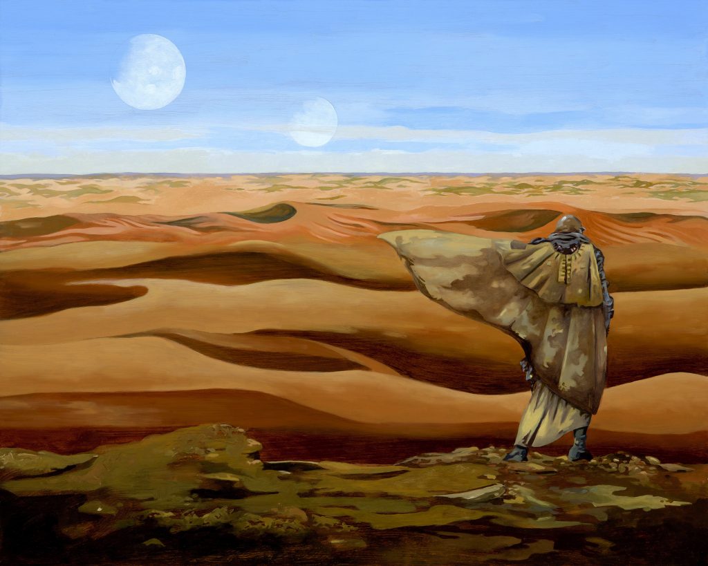
Dune’s iconography is well established, having already been illustrated by some incredible artists. I tried to set that aside and create a Dune that honoured Herbert’s text, but had a slightly different aesthetic – I tried to bring an element of unexpectedness to the technology and creativity to the compositions, particularly where metaphysical concepts came into play. For Dune’s cover I worked in oil. I wanted a traditional, rich look where some of the underpainting peeks through – I always loved that quality in the work of Jeff Jones and Frank Frazetta. I went with a simple composition, a lone Fremen in a sea of sand.
At the time I was working on the book, Denis Villeneuve’s film had just been released. I put off watching it for months to avoid being influenced – no easy task for a fan of the book and the director! I’m really pleased with the quality of the book. Paul was conscientious in every detail of its production and it was a huge honour to be part of that.
Is there one thing you wish you could have learned early on about making art or working as a commercial artist, from someone who was experienced in the field, that you would like to share with other artists?
Don’t say yes to everything. When you are starting out, trying to build a portfolio and profile, it is very tempting to take on everything that comes your way. If you don’t resonate with a project, it’s worth stepping back and considering if you really want to invest time into it. It’s flattering to be asked, but it’s also very easy to underestimate how much time a project will take and if you are not feeling it, that can turn into a very special kind of hell. When I was just starting out Clive Barker kindly advised me to never submit anything but my very best work. I have lived by those words ever since, even when it meant re-working or even abandoning an illustration with many, many hours invested. It changed my workflow in the sense that I plan my time to allow for experimentation, and to ensure that if something does go sideways there is still time to cry and recover! I think you always have to push yourself that 10% beyond your comfort zone to keep growing artistically, and when you work in that zone there is always a chance for failure. And it’s true, a good night’s sleep really does lend clarity and perspective!
Is there something about what you do as an artist working in the SF/F field, or an upcoming project, that you’d like to tell our readers about?
I am currently polishing my fourth novel, which I plan to pitch as an illustrated book. It’s a fantasy novel about a young woman searching for a missing ten-year-old boy with whom she shares an unnerving and unpredictable power. Of course, there are some very nasty people in her way. It’s been a lot of fun to write and discover these characters and I cannot wait to share their adventures with readers.
 Cover and interview design by Francesca Myman, art by Richard A. Kirk
While you are here, please take a moment to support Locus with a one-time or recurring donation. We rely on reader donations to keep the magazine and site going, and would like to keep the site paywall free, but WE NEED YOUR FINANCIAL SUPPORT to continue quality coverage of the science fiction and fantasy field.
©Locus Magazine. Copyrighted material may not be republished without permission of LSFF.


